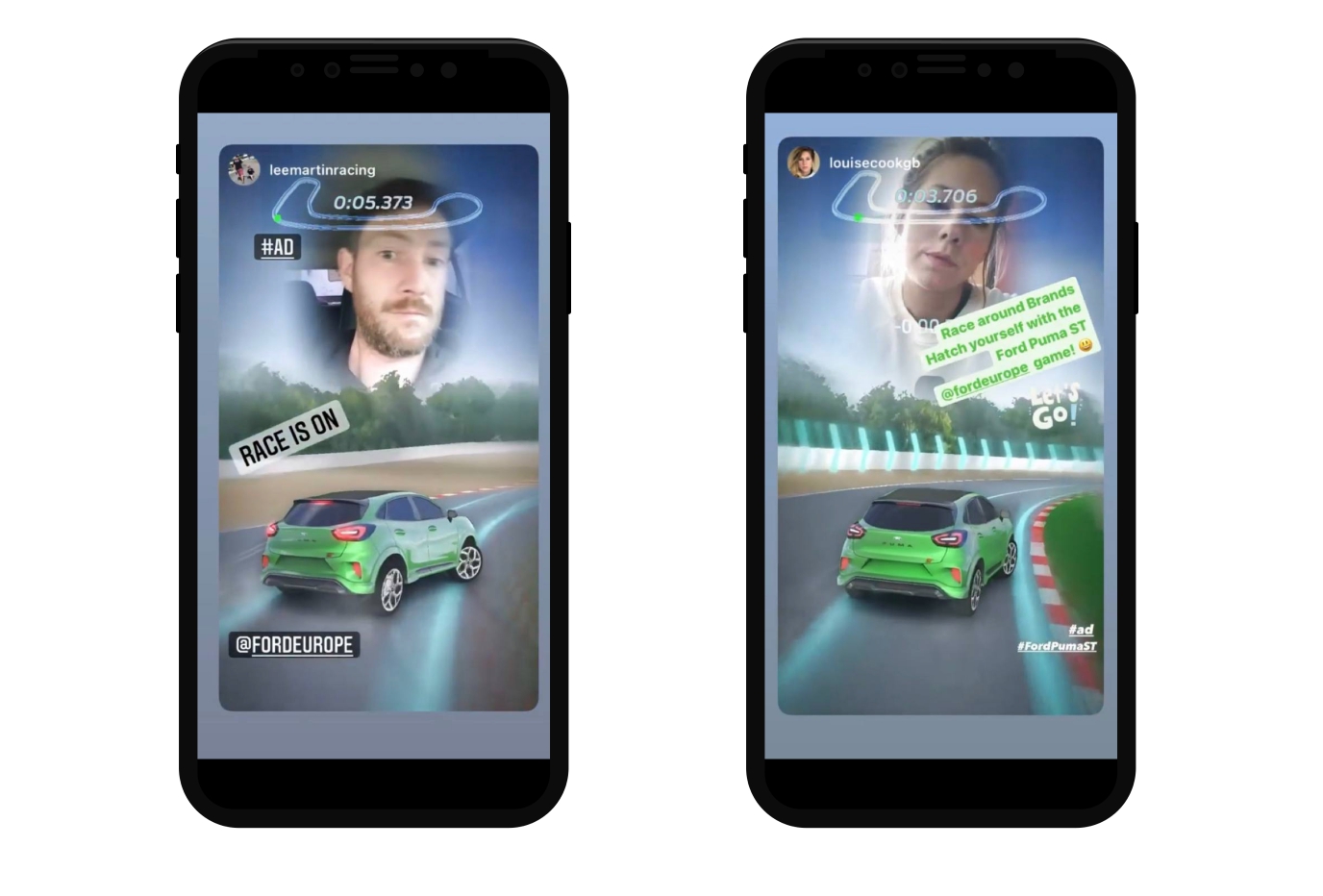
Ford Europe AR Game: How To Create a 4 MB Instagram AR Race
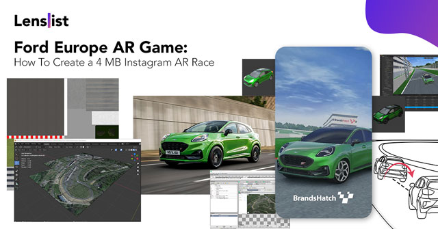
Kyiv based studio AREYES has been developing AR products for social media platforms since 2019. The company has completed projects for Sony, L’Oréal, Lego, Red Bull (DE), Real Me (Global), etc. In this case, the studio tells how it managed to fit a full-fledged race into 4MB.
Backstory
We were the first developers who adapt a full-fledged racing game for an Instagram filter. Before that, everyone believed that the social media could only fit simple design effects (one layer with simple mechanics), but our work uncovered broader possibilities of Spark AR Studio as for creators as for brands. The case drew the attention of developer communities. Some of the digital marketing specialists in these communities were already looking at the possibilities of AR and Ford was one of them.
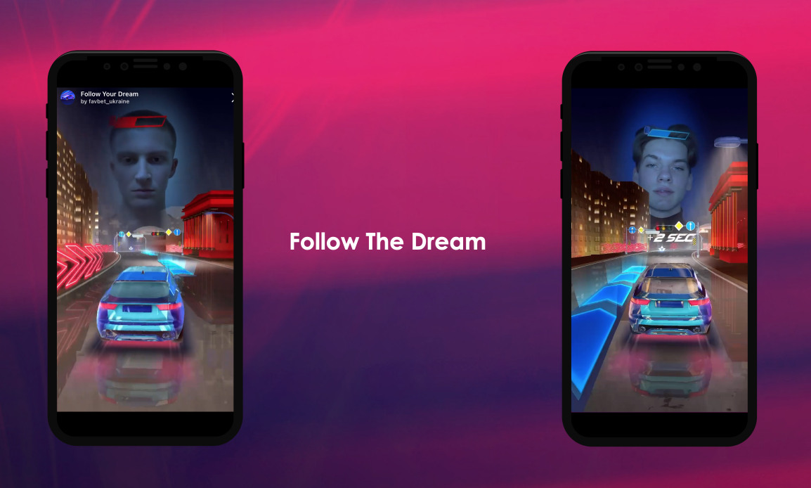
It’s a general trend: in the last two years, big brands and companies are increasingly turning to gaming as a tool for communicating with a younger audience. The GTB agency that manage Ford Europe also looking for different interaction formats included Spark AR for the new ad campaign and was find an interest Follow the Dream project.
Idea
In 2020 Ford launched the new urban SUV, Ford Puma ST — a car that rivals a race car: fast to respond, sharp in cornering, truly built to thrill, just like the tagline says. To promote the car, the marketing team used the gamification capabilities of Spark AR games along with traditional advertising channels and plan to create an Instagram race.
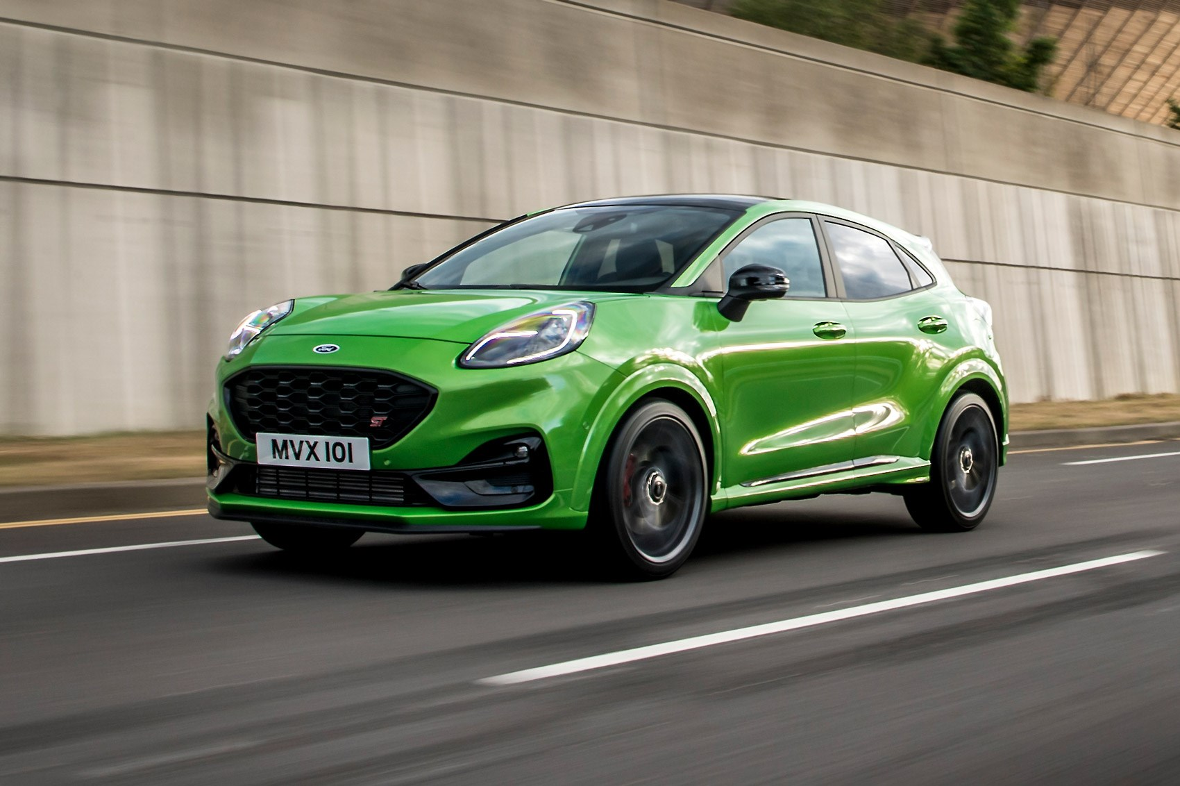
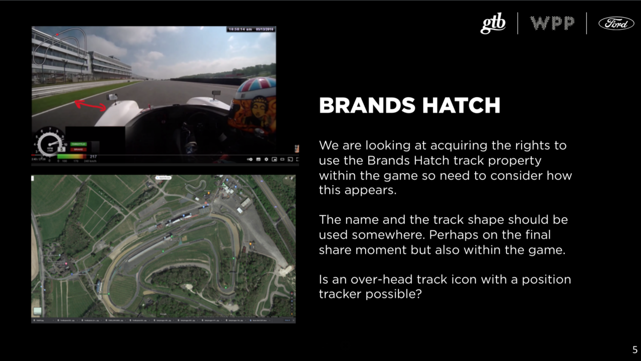
It has to be a simulation of a race on the Brands Hatch Track, located southeast of London. The main challenge of the project was to use an actual map. We had to recreate a realistic cornering on a real track, and we couldn’t afford for it to look like 2D simulations; otherwise, it wouldn’t convey all the advantages of the car.
Concept
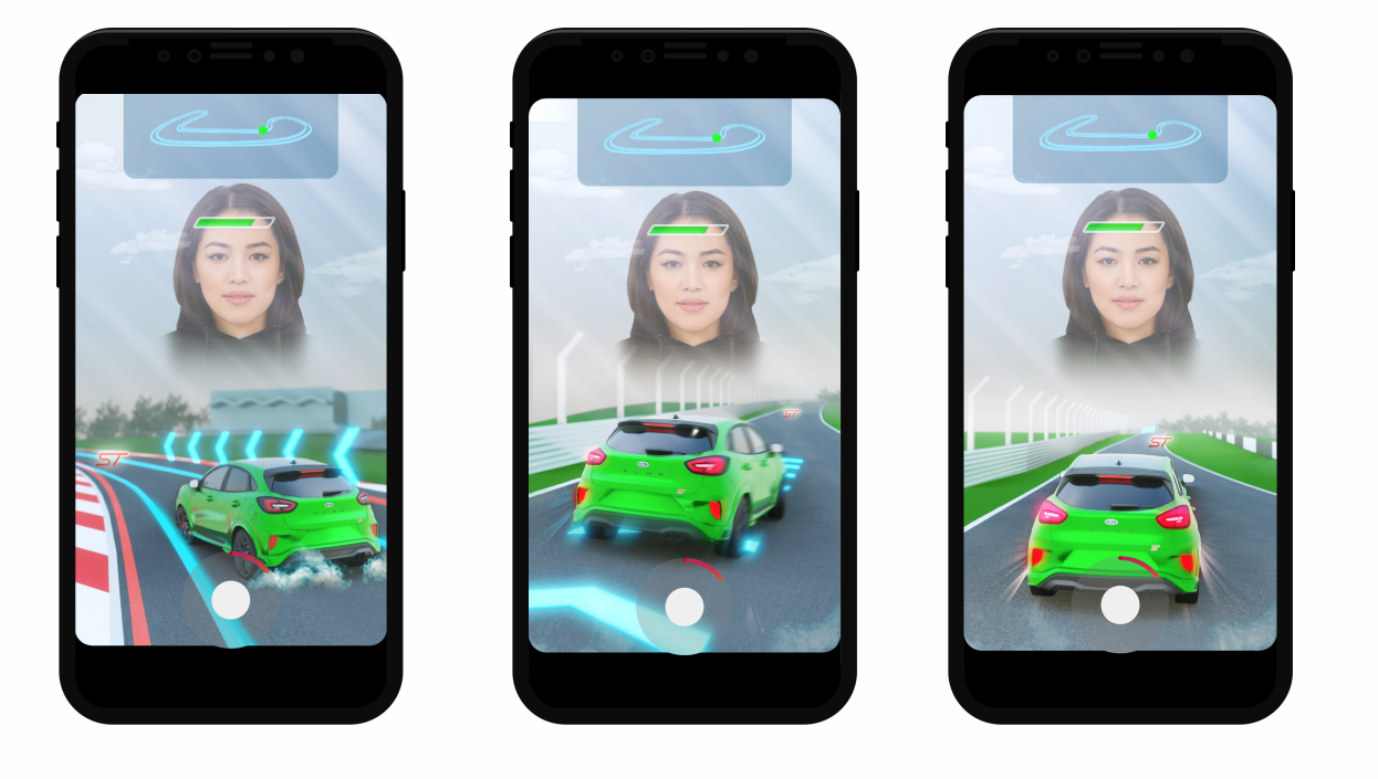
For the client and the team to imagine the final product’s appearance, we started by preparing a detailed game scenario with mechanics, game logic, and part of storyboards — this is our process for each Spark AR project. Whether it is a simple AR effect or a game, all participants must have a clear, understandable, and — most importantly — an approved reference point. This product was no exception, and we immediately drew:
- the interface;
- the position of the camera;
- the position of the player’s head (it’s still an Instagram filter controlled by the user’s head);
- special effects of turns and acceleration of the car;
- the setup of the shot;
- color guidelines.
The project team:
- Project Manager;
- Creative Producer;
- Art Director;
- 2D & 3D Artist;
- Technical Director;
- Technical Artist;
- Lead Artist;
- QA Engineer
The creative producer played a crucial role, as he wasn’t just responsible for the idea but could also critically look at the finished game play through the eyes of the client and the player.
The technical director helped the team meet the deadlines by running the development of mechanics alongside concept work. The finished product was supposed to be ready in a month as the advertising campaign had a strict timeframe.
Development
Element number one — the map
For this project, we couldn’t just create a fiction environment around the track. We had to reflect an actual Brands Hatch Track, which hosts many British and international competitions. The idea was to give a total immersion in the atmosphere of the race from the very first second, and if so — we couldn’t allow ourselves to copy and redraw — we only used the original track.
- We found the track in Google Maps.
We learned that the map on Google Maps was flat and didn’t reflect the surface elevation and irregularities. That’s why we started looking for ways to extract the desired fragment of the landscape in 3D.
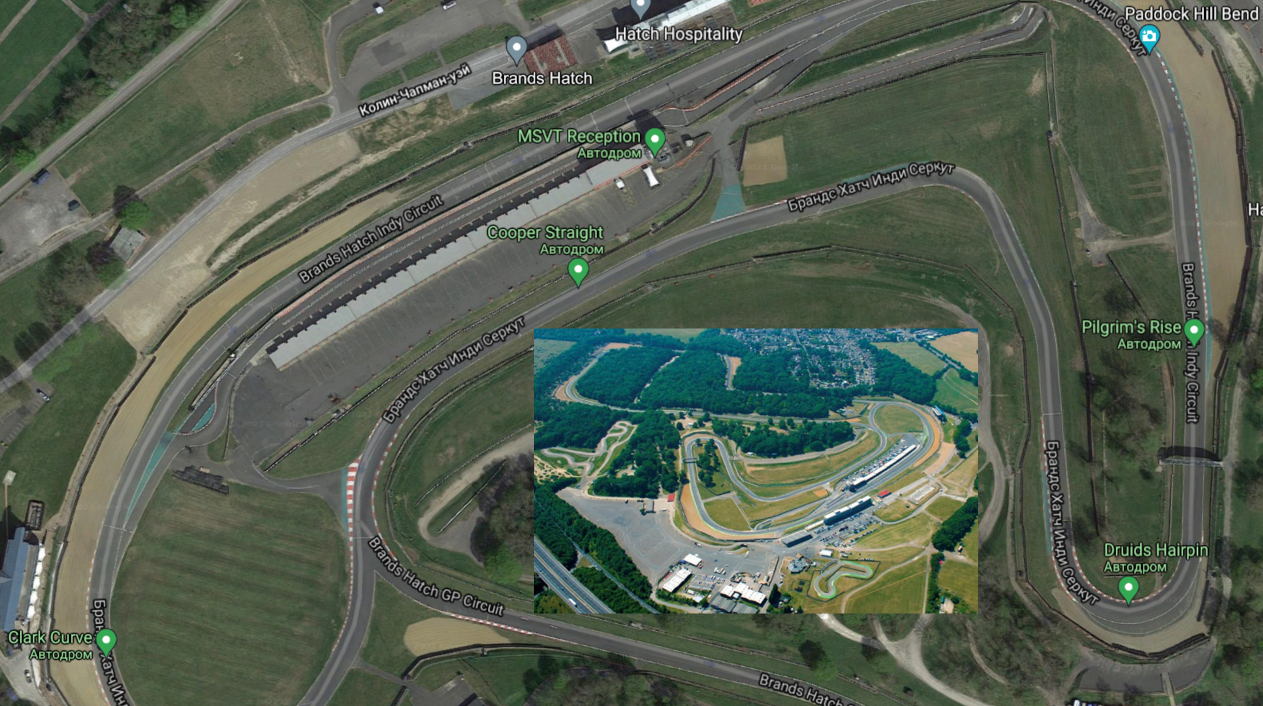
We used:
- Blender 3D — open-source 3D-modeling software;
- add-on to Blender — Maps Models Importer;
- Render Doc — open-source graphical debugger;
- a little patience.
As a result, we got a 3D screenshot of the terrain with the required elevation differences. When we compared this model to YouTube videos of the track, we saw that our idea was successful.
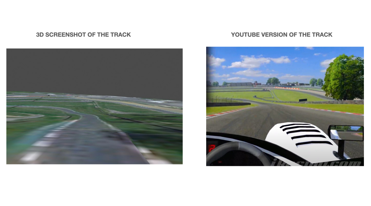
Technical details on how to draw the terrain from the map
- Launch the Google Chrome browser in a specific mode providing the process’s PID.
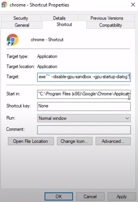
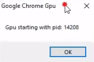
- Run Render Doc, Inject into the process, find our process by PID.
- Open the area of interest in Google Maps in the Google Chrome browser you opened previously. Look for the Capture Frame button.
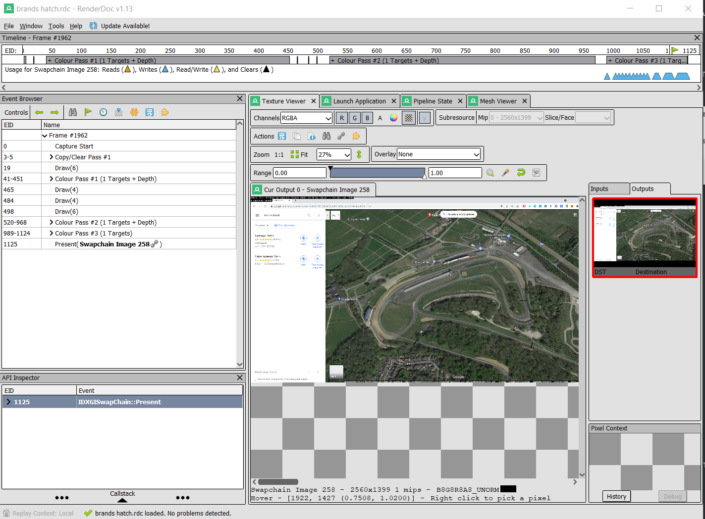
- The software makes a 3D scan of the area.
- Go to Blender 3D, connect the add-on Maps Models Importer, load the exported map file.
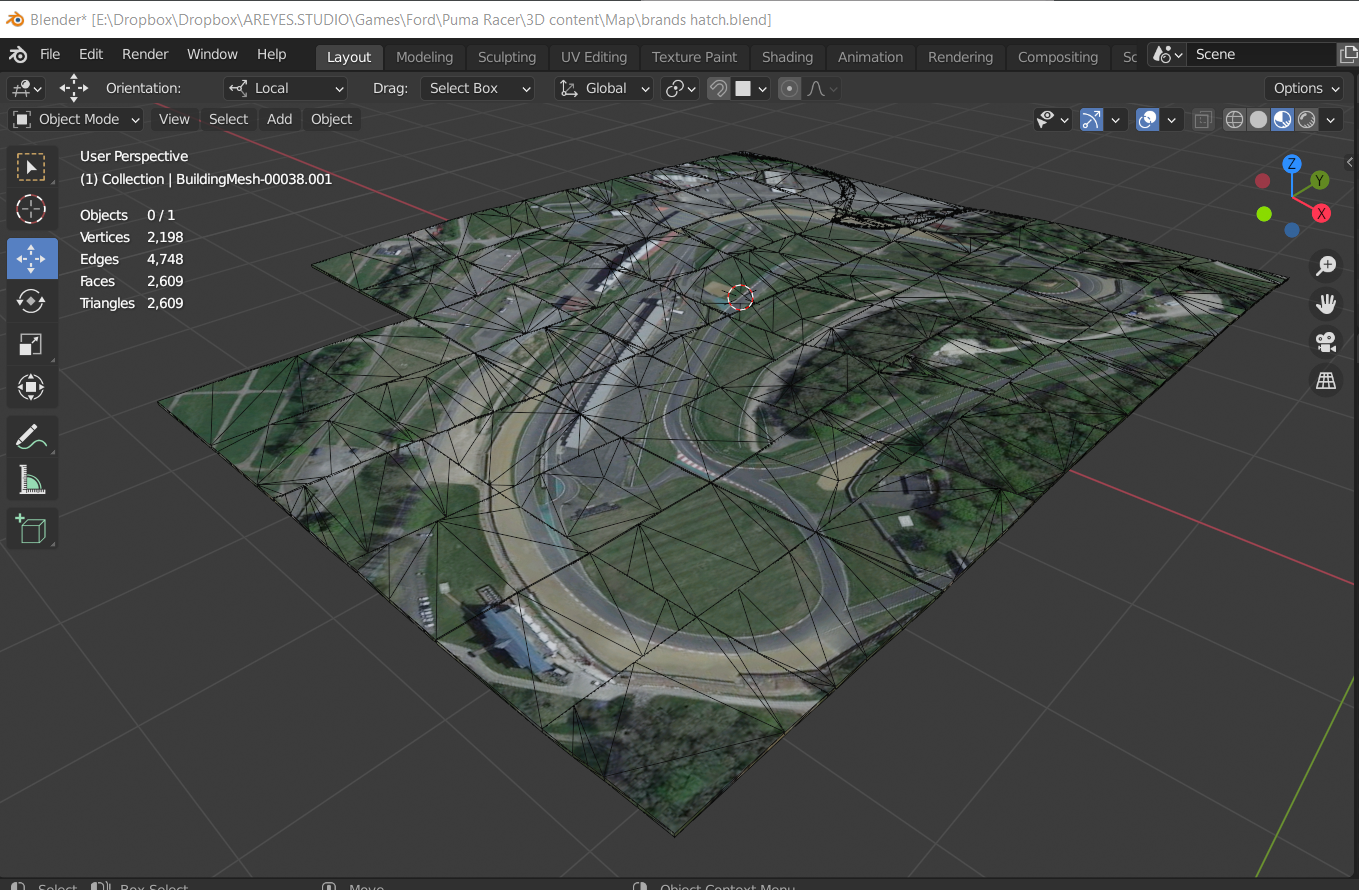
- Comparing the result with the reviews of the track from YouTube, we notice that essentially the idea to recreate the landscape level is a success.
- Next, we brush up the landscape.
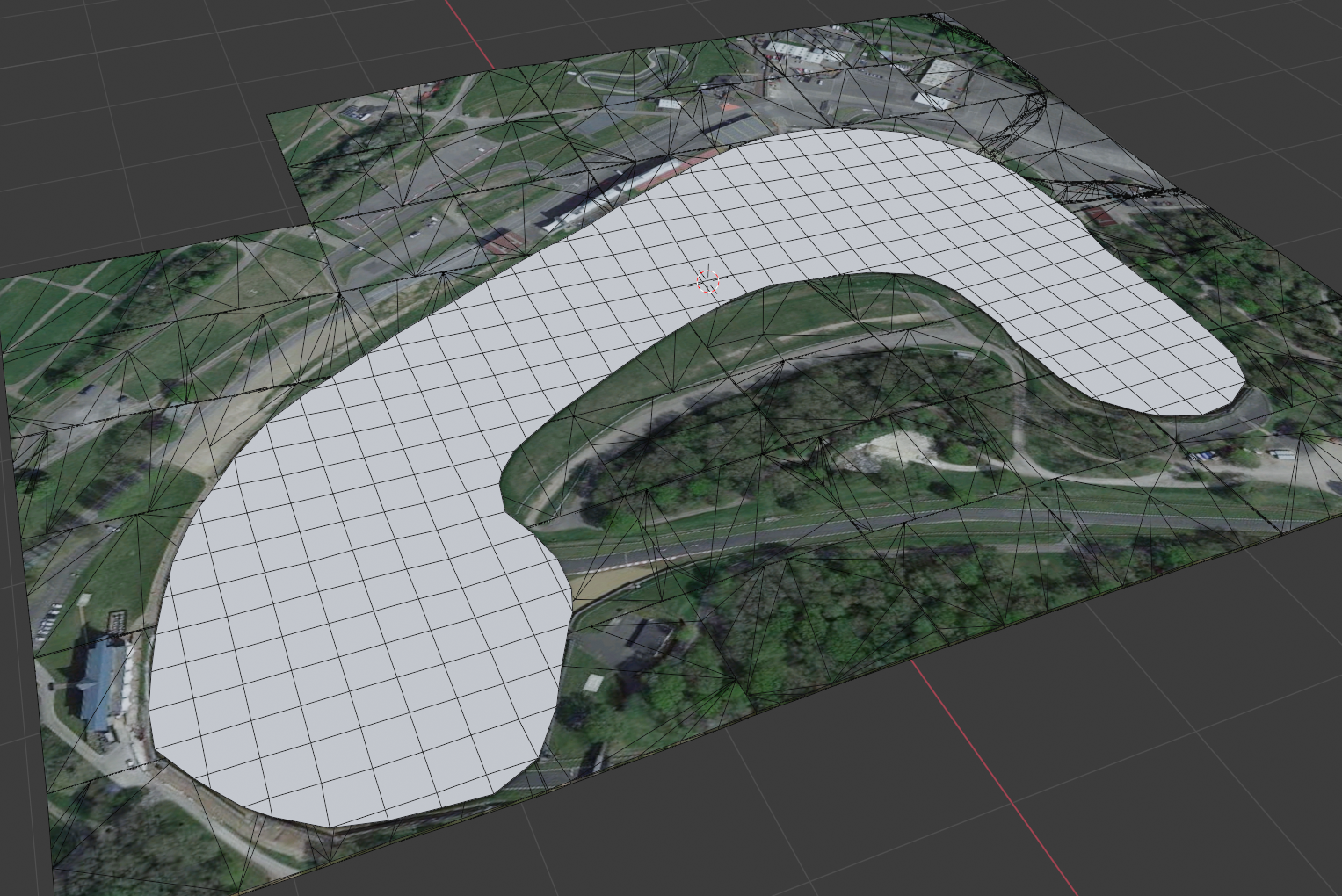
- Add the road.
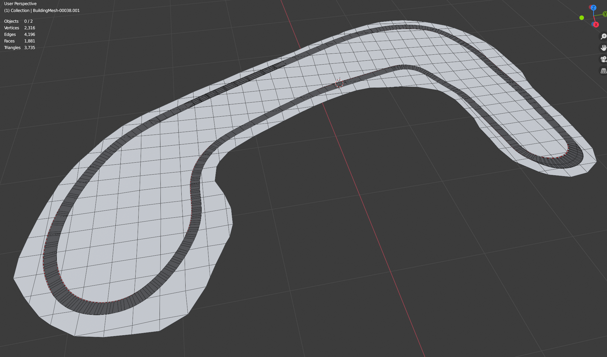
- Send this to the artists.
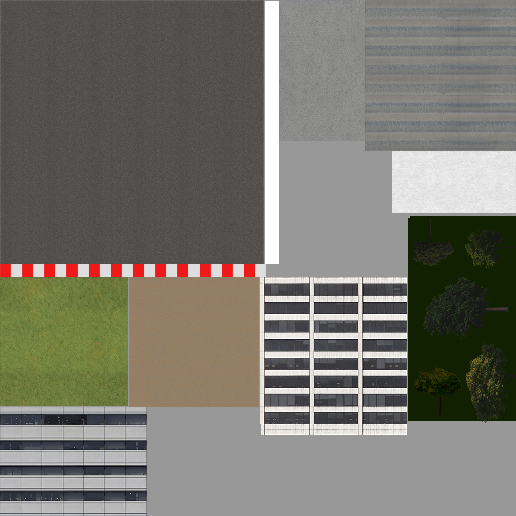
We had less than 2 MB of space for the whole map, so we used a texture atlas and placed all the patterns necessary for painting the track on it.
It looked realistic: just as if we arrived at the track early in the morning to train before the upcoming race.
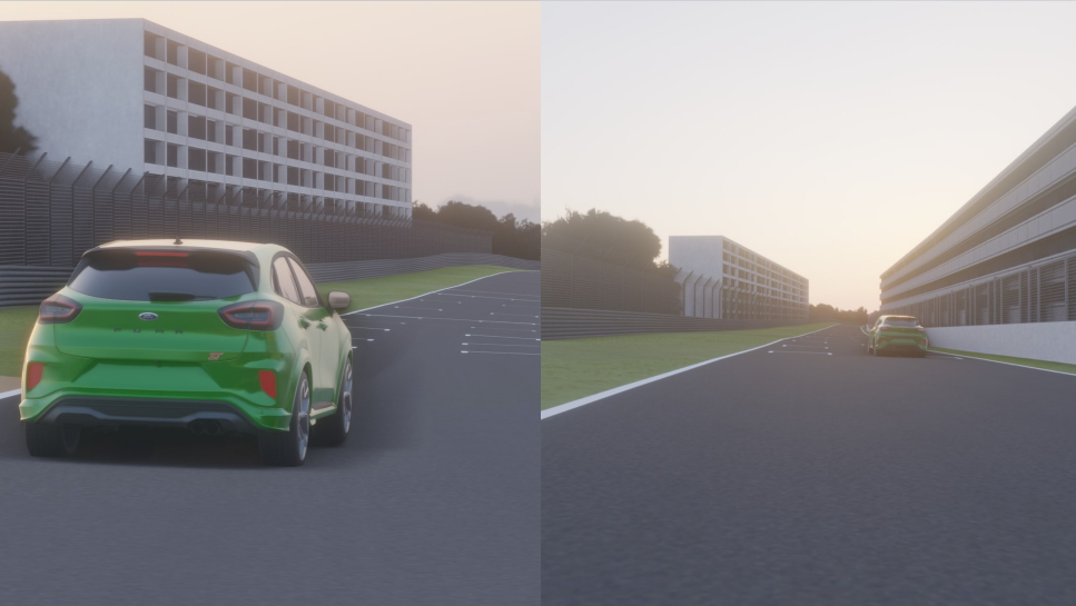
Element number two — the car
We couldn’t use a random car model: the player had to drive exclusively a Ford Puma ST. The client provided us with a 3D model of the car, but it was more than 100 Mbytes in size instead of 1.5 Mbytes we needed and consisted of 1.5 million triangles instead of around 10k.
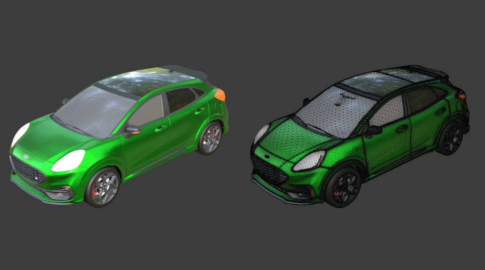
We optimized it using the traditional game development method: model retopology, baking normals and base materials, creating textures in a substance painter. In essence, we rebuilt the model, reducing its size multiple times while maintaining sufficient realism. The final version of the car model consisted of 6,600 triangles — and that’s the size we could work out.
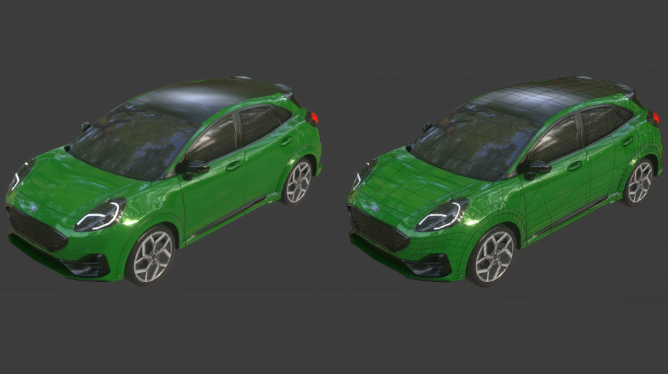
Element number three — special effects
If you look close enough, you’ll notice several visual elements such as switched-on headlights, tire marks on the road, and smoke from under the tires. All this, in combination with illuminated interactive objects directly interacts with the user, showing what’s happening.
Also, we integrated acceleration, which distorts the picture from the camera, adding even more dynamics to the game.
Element number four — mini-map
Mini-map is a familiar element for powerful computer games, that has never been implemented for Instagram filters. It’s a duplicate of the road, repeating the coordinates of the car. The map is overlaid as a texture on top of the final game frame and is rendered separately. We needed to allocate memory space for it as well.
Technical solution
To build the trajectory and preserve the shape of the landscape, we used an obj file with information about the extreme points and calculated the car’s position along five axes, XYZ, rotationX and rotationZ. We calculated the rotationY axis from the difference between the current vehicle position and the position 50ms earlier. We managed to make the car fit the bends of the road along the entire track.
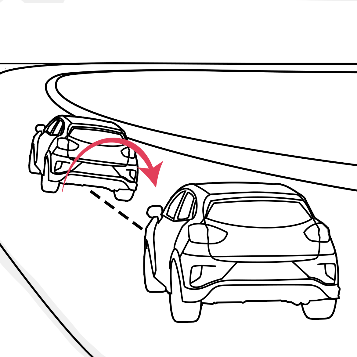
And that’s not all. If you take a closer look at the car while playing, you can see that it turns the wheels, leaves marks on the road, and even tilts to the side during turns. To get this effect, we made a simple rig of the car (each wheel has an axis of rotation and position) and deduced the parameter of the rotation curvature. The same goes for the car body tilt: when the car turns to the left, the body tilts to the right. It seems that the car is skidding, but this is just an optical illusion.
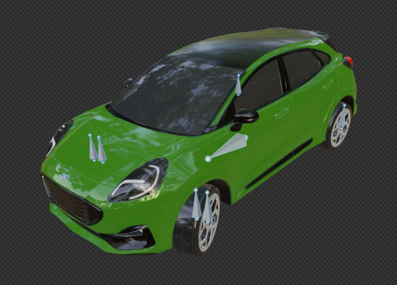
We enhanced these two effects by animating the picture around the car.
In the Spark AR Studio, the camera is fixed and can’t be moved. We went from the opposite: while the car is stationary, we animate the entire world around it. It’s like an illusion of movement when we’re at a train station, and it seems that our train is moving, while it’s the train on the other track that does.
We also used our own SDK to speed up the development of game mechanics. SDK is our internal product, and we’ve developed many ready-made templates of the most popular game mechanics for Instagram based on it.
In the end, the game took 5800 lines of code.
One of the biggest joys working in Spark AR Studio for having one of the best node hierarchy scene organizational. FYI: node hierarchy responsible for setting up the visual, less for the mechanics of the game.
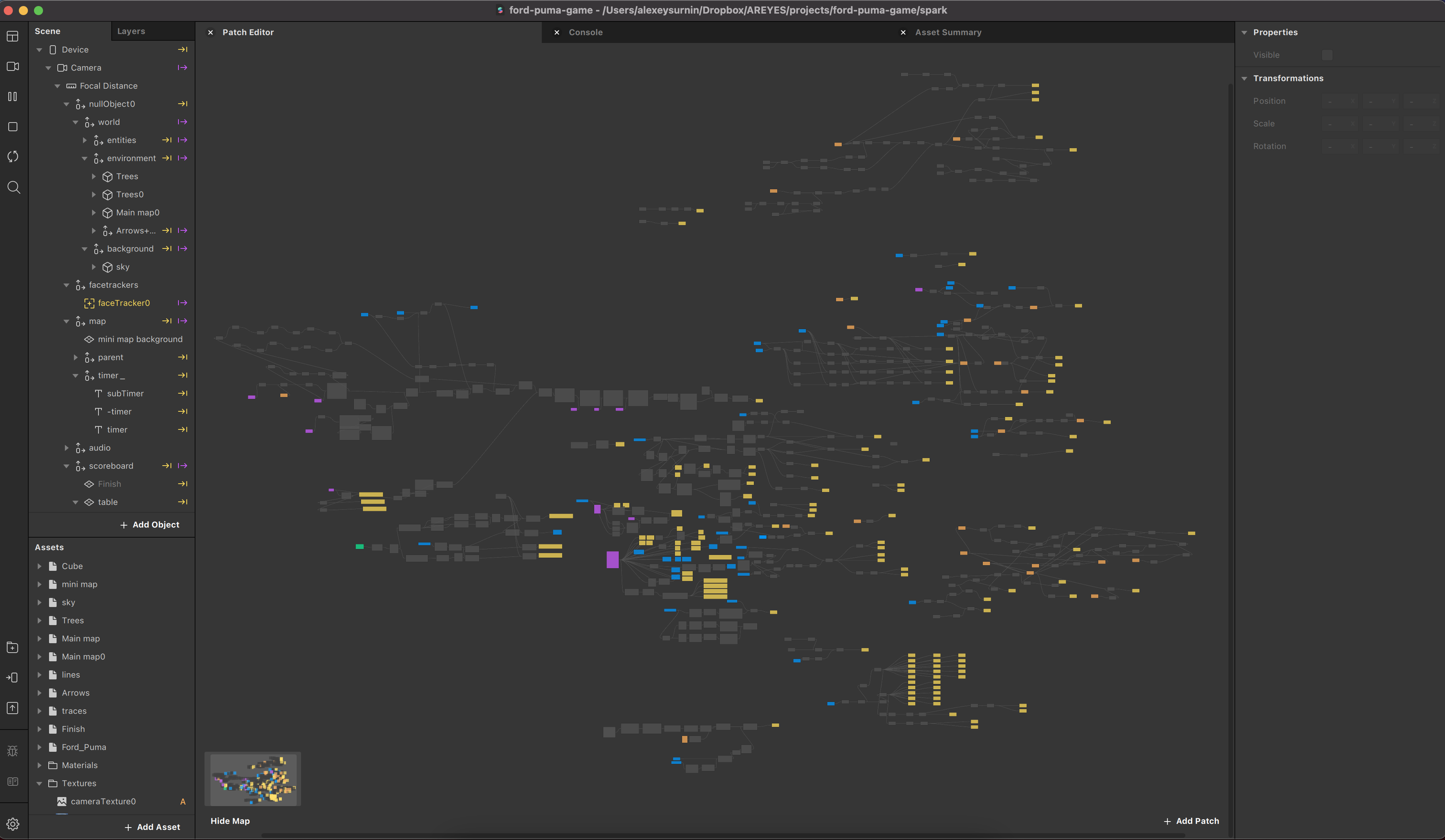
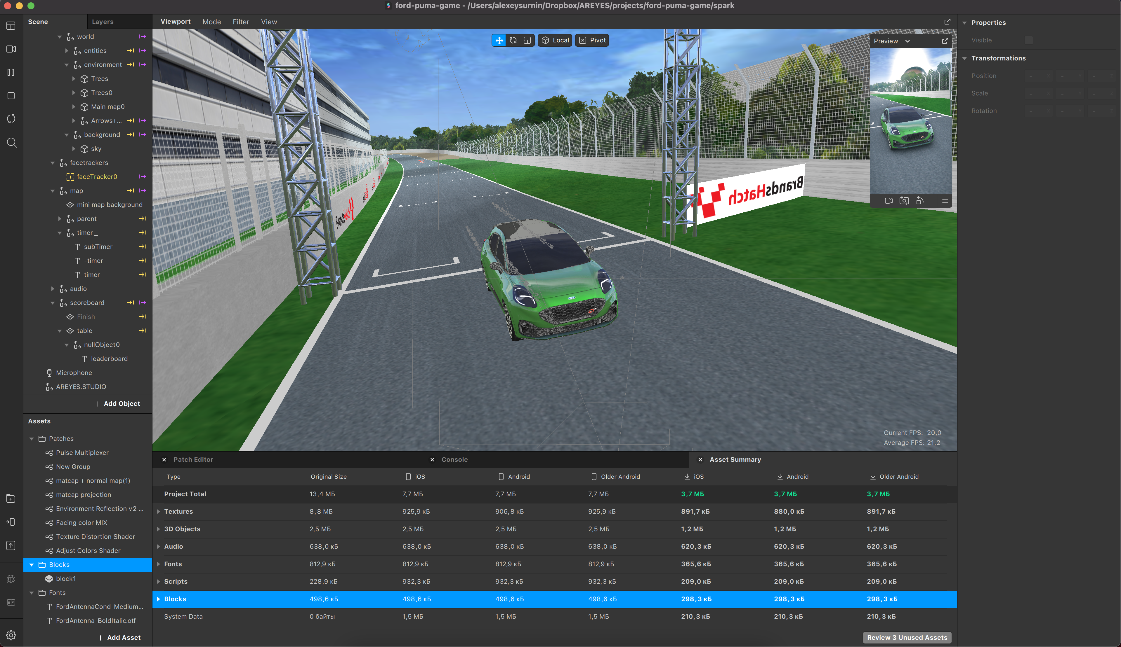
The screenshot below partially shows the hierarchy of the project and the space that the final source takes.
Result
After a month of well-coordinated work, we got a dynamic AR game, in which a person doesn’t just look at the product, but, engaging, interacts with it for an entire minute, which can’t be achieved by any traditional advertising channel. The organic promotions of the effects only after 2,5 weeks from release driving over 775K impressions, 75K game session / AR effect uses, and 2K shares.
